B.R.E.C.K asbl

Client: B.R.E.C.K.
Date: Avril 2024
Website Link: www.breck.lu

The Project

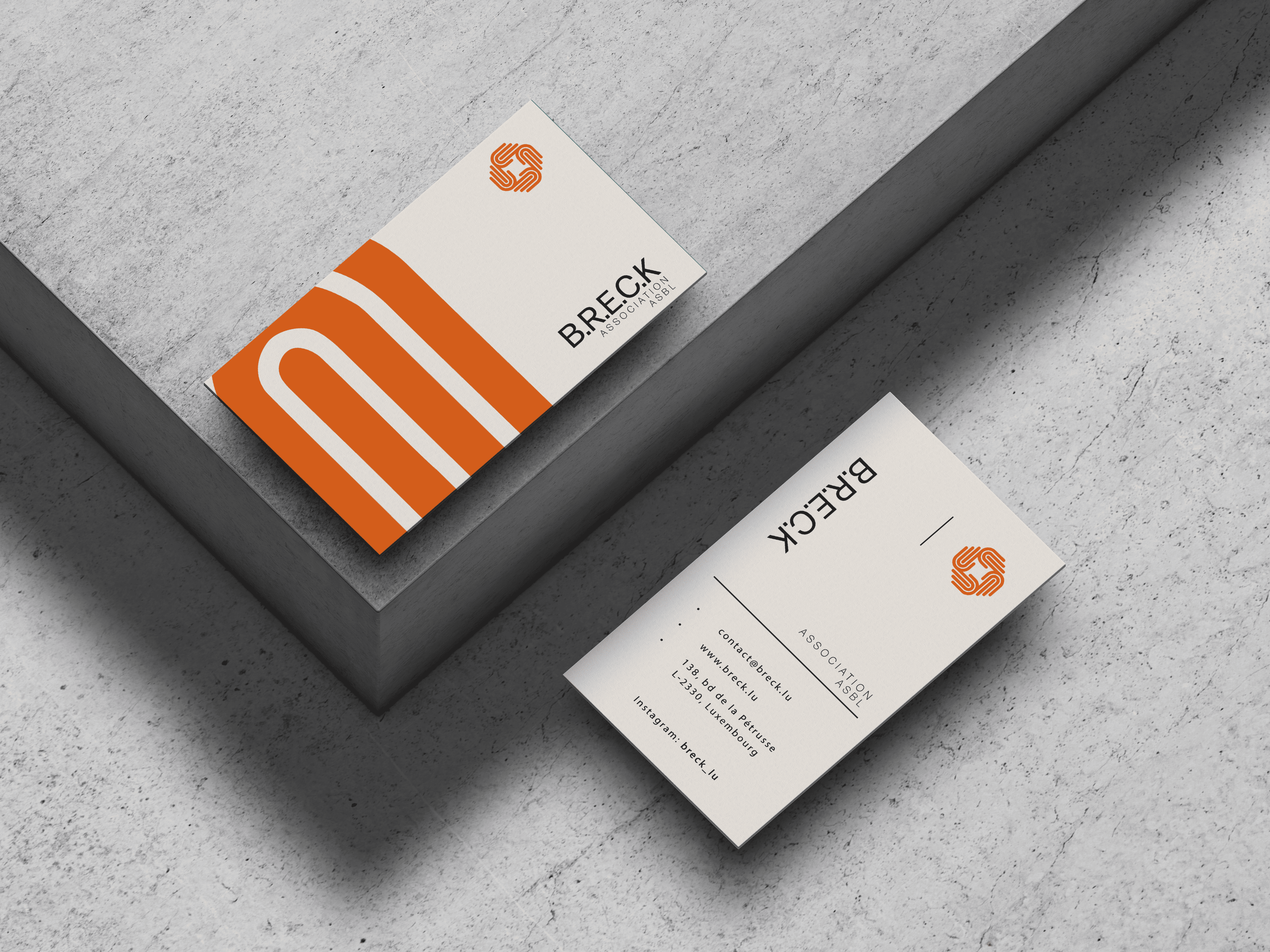
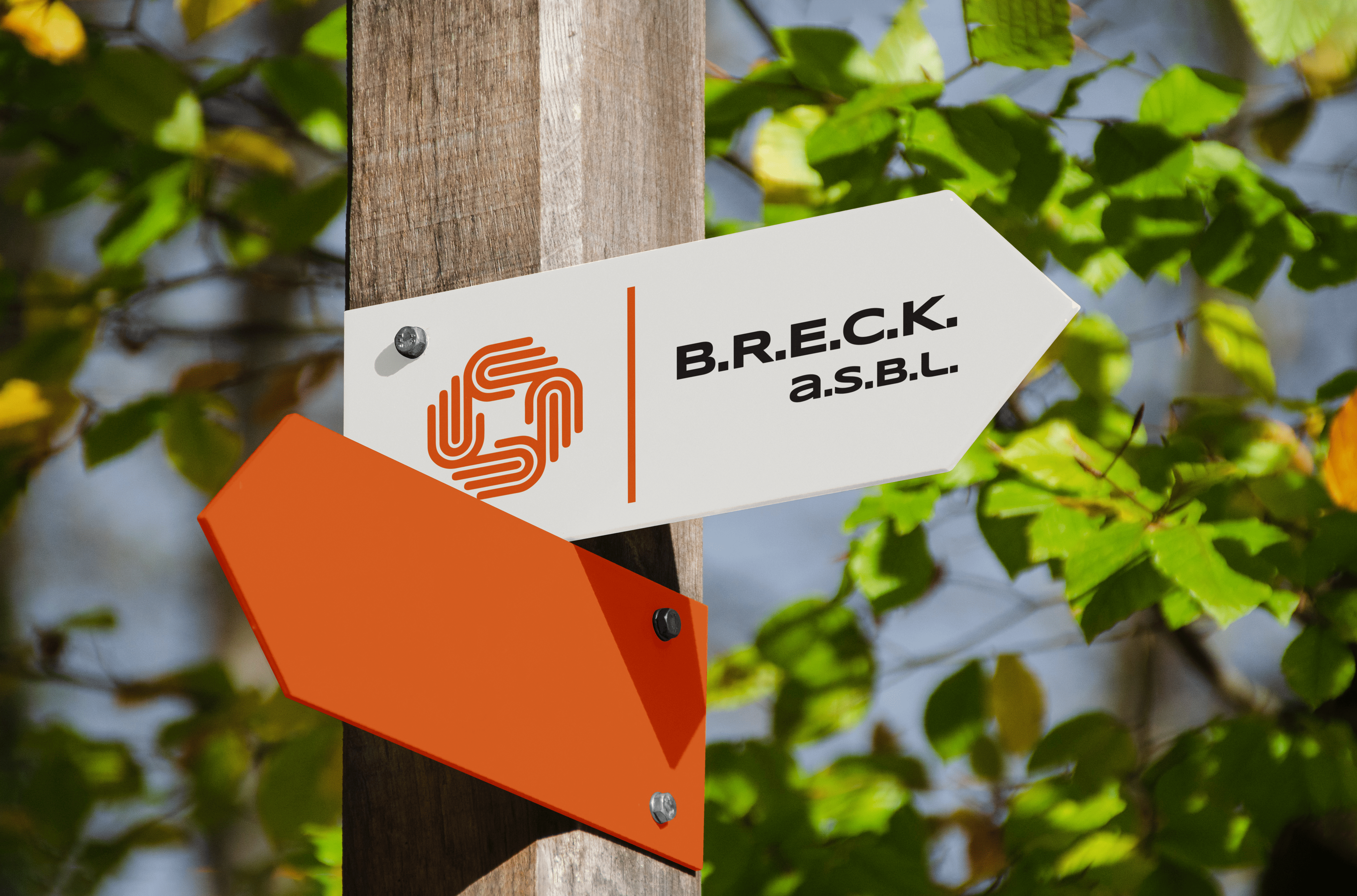
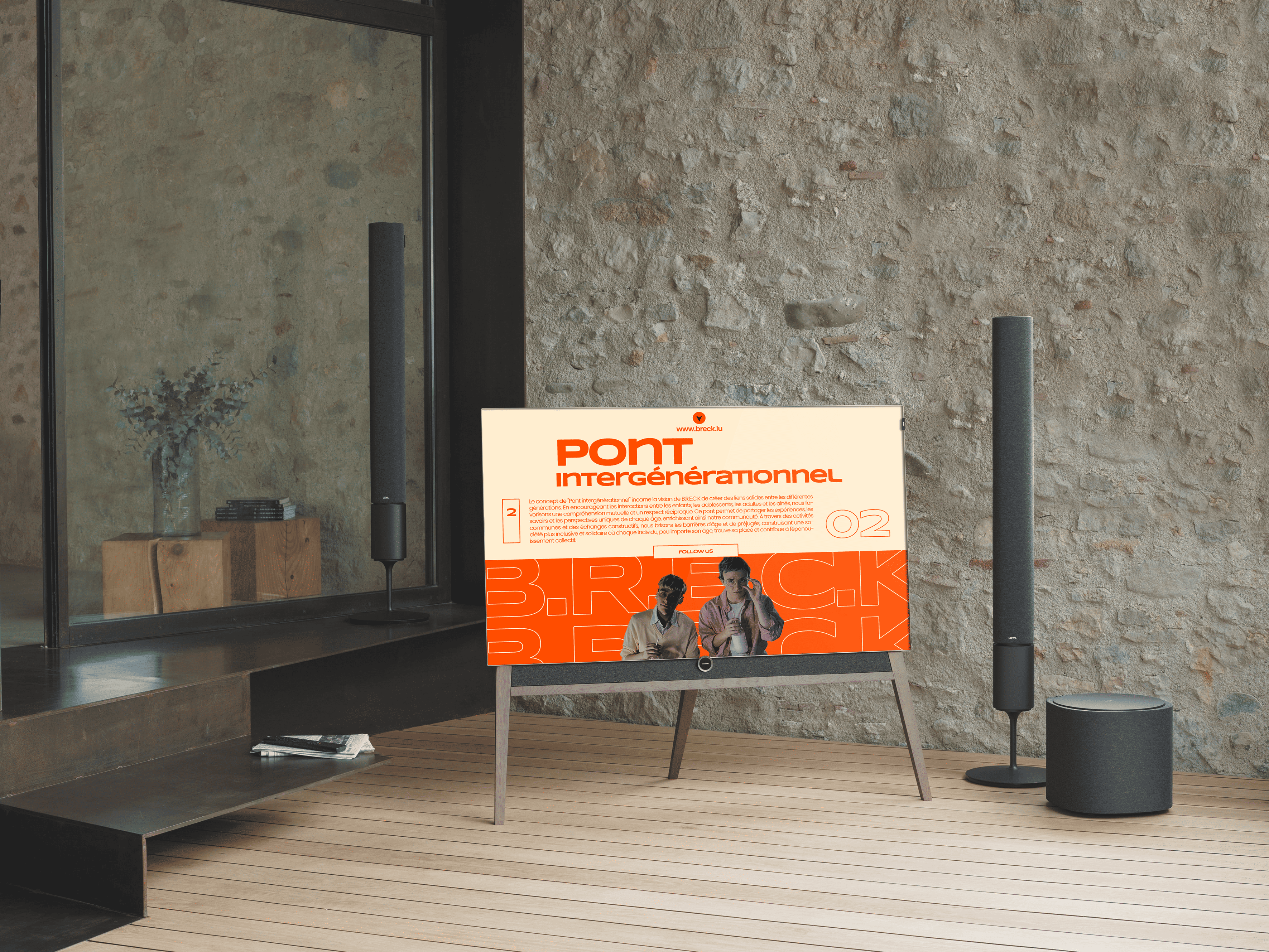
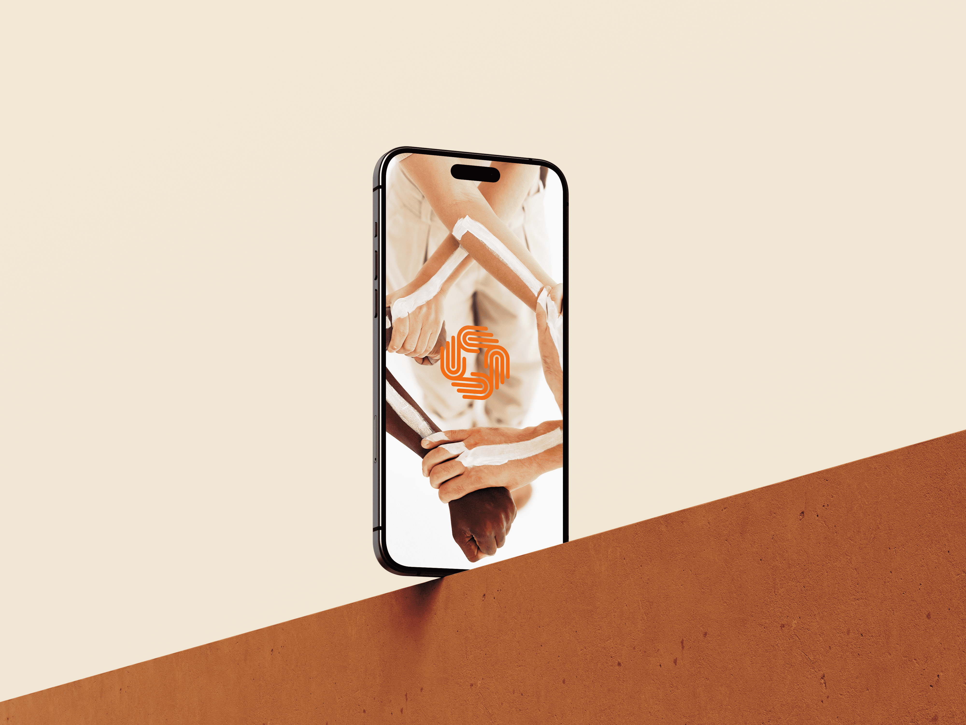
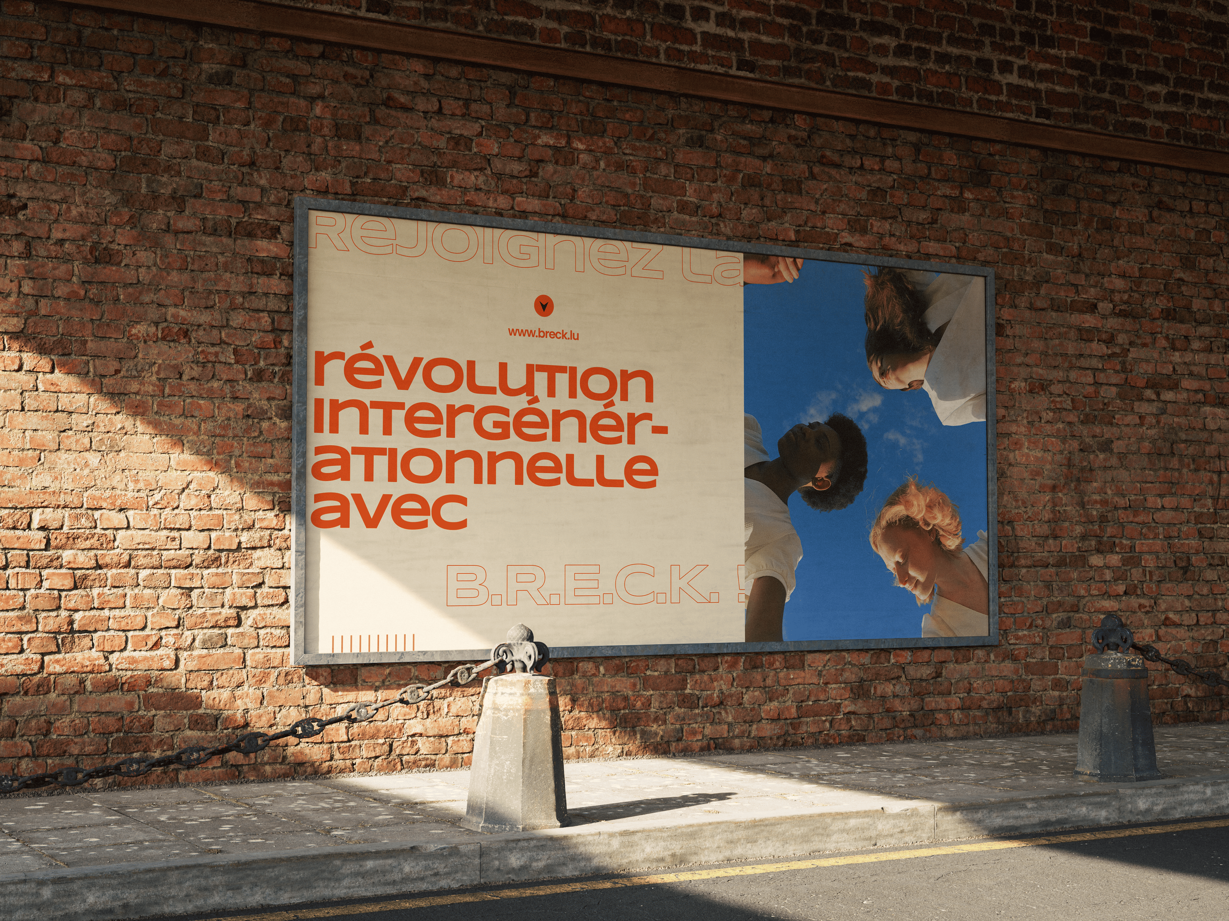
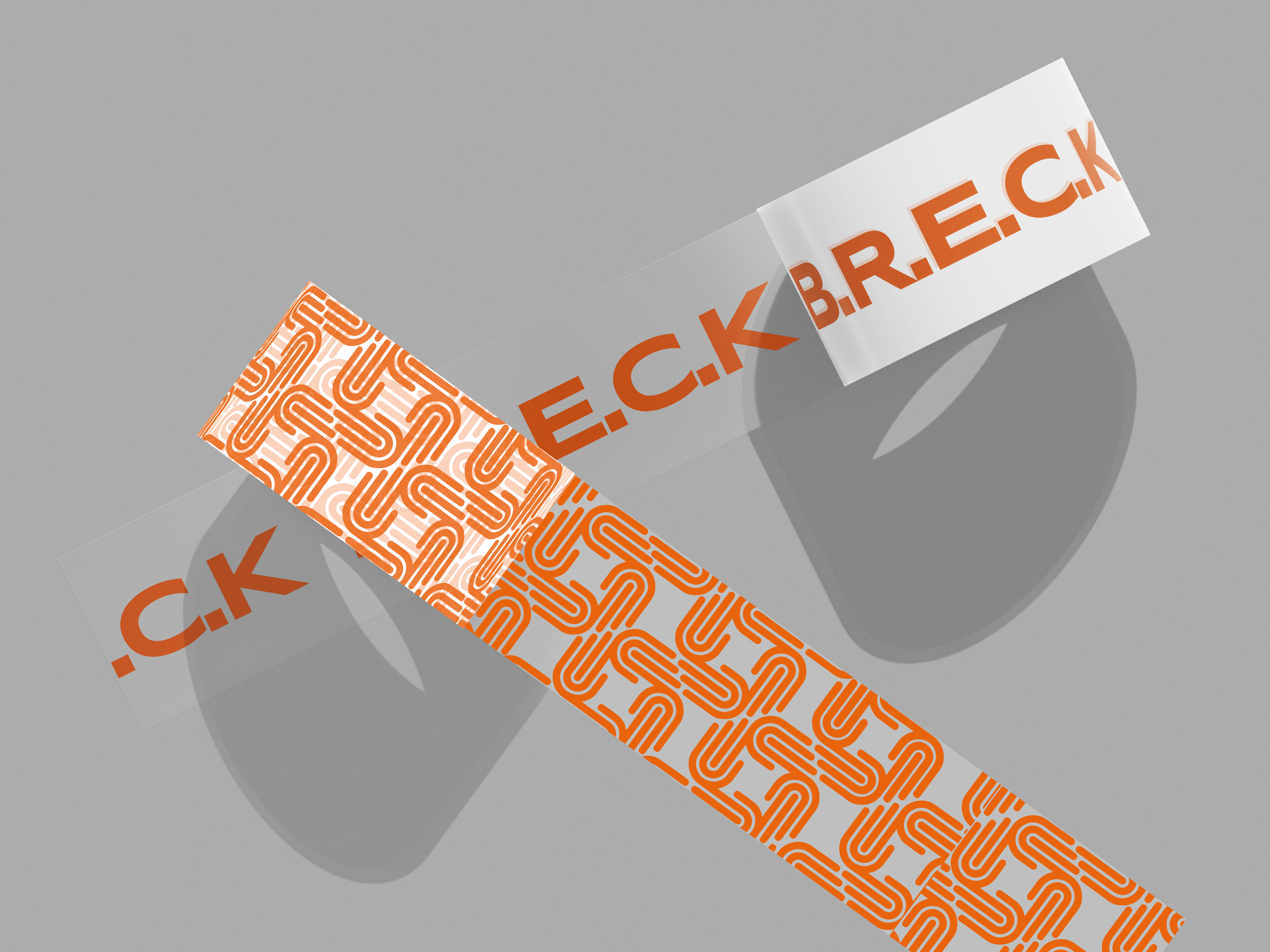
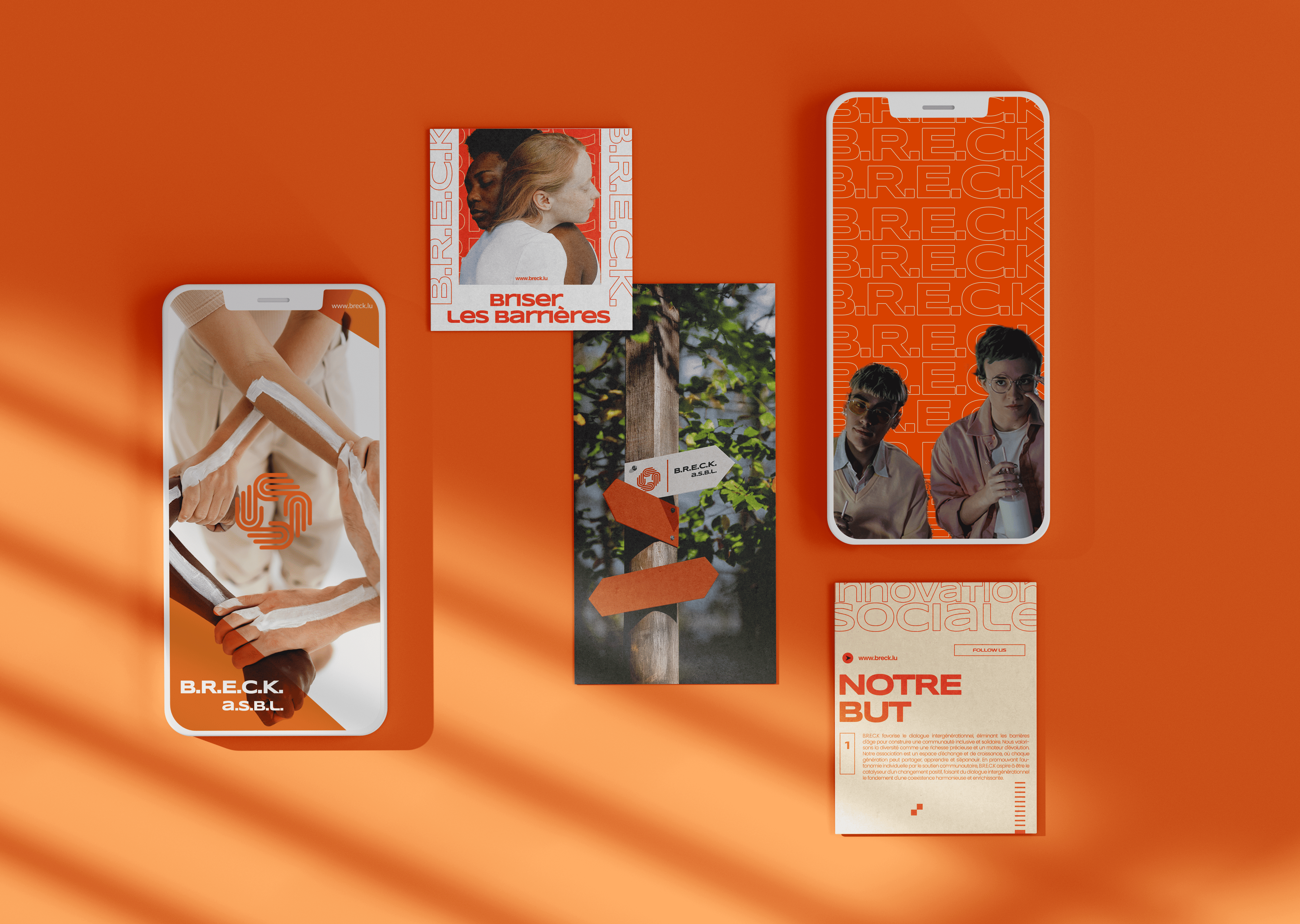
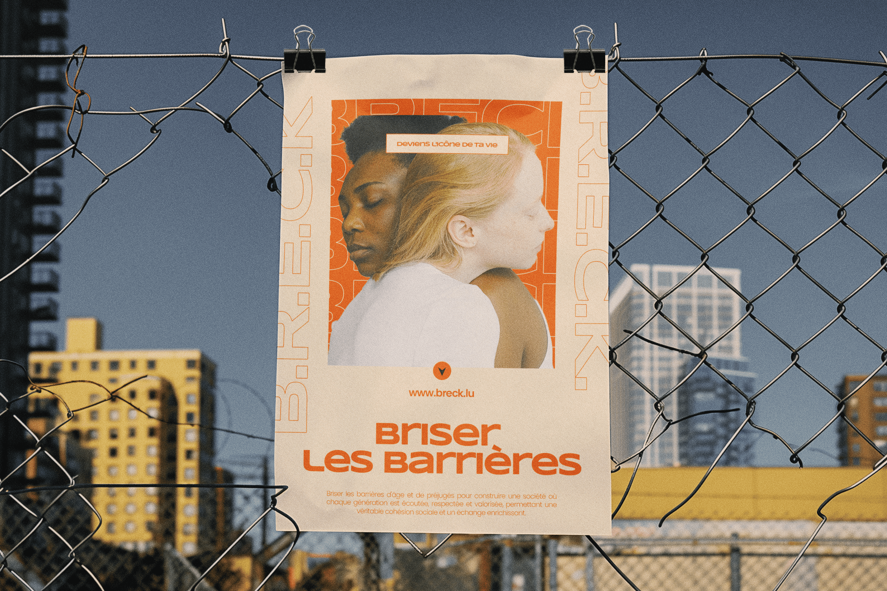
This project focuses on breaking down age-related barriers through dynamic visual storytelling. Using a bold and modern color palette dominated by vibrant shades of orange, the design exudes energy and positivity. Each visual element, from social media graphics to posters and cards, is crafted with a contemporary aesthetic to foster inclusivity and social awareness. By combining powerful images with sleek, modern typography, B.R.E.C.K. captures attention and inspires audiences to join in promoting social harmony.
Branding Project 1

Work Process

An insight into the creative journey, from idea conception to impactful social messages.

I began by researching age-related social issues and exploring how design can break down these barriers. Through analyzing audience needs and preferences, I identified that bold colors and visually engaging elements would be essential in attracting attention and fostering inclusivity. This stage helped shape the project's direction towards a vibrant, socially impactful design.
The concept for B.R.E.C.K. combines powerful visuals with modern typography to create a compelling social message. By using bright orange tones as the primary color, I aimed to create a vibrant, approachable aesthetic that symbolizes positivity and energy. This color choice, combined with high-quality images and dynamic layouts, ensures that B.R.E.C.K. stands out as an advocate for unity across age groups.
During development, I refined each design aspect to achieve a cohesive and visually appealing look. The images, fonts, and colors were carefully selected and aligned to create a memorable brand that conveys a modern and impactful social message. From print media to digital assets, each piece reflects B.R.E.C.K.’s mission to inspire and engage people of all ages to join hands in breaking down age-related barriers.
Return to portfolio